
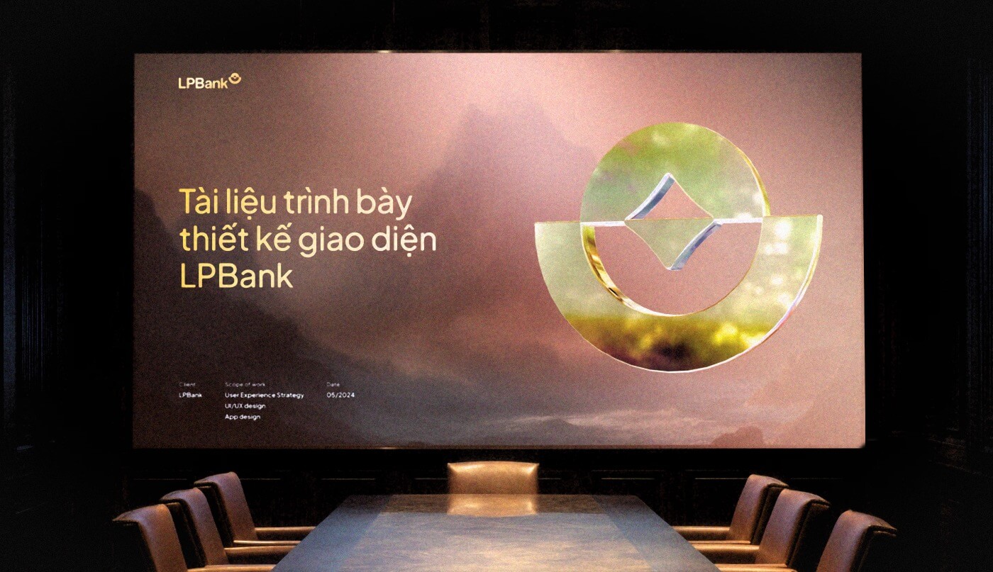
Redesign LPBank’s Personal App
Project type
Mobile & Web app
Timeframe
Jul 2024 – Oct 2024
Role
UI Project lead
Credit
Beau Agency
Preface
Preface
This isn’t some big case study with complex chart, interview report, complex persona…
This isn’t some big case study with complex chart, interview report, complex persona…
This isn’t some big case study with complex chart, interview report, complex persona…
Just a simple story about my time walking through the UI side
Just a simple story about my time walking through the UI side
Just a simple story about my time walking through the UI side
What i’ve done
What i’ve done
UI Concept
UI Concept
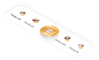
Information Architecture
Information Architecture
Prototype
Prototype
Design System
Design System
Business Collaboration
Business Collaboration
Design Implementation
Design Implementation
A quick look at what I’ll be sharing in this story
A little confession about using AI
A little confession about using AI
A little confession about using AI
A little confession about using AI
Project type
Mobile & Web app
Timeframe
Jul 2024 – Oct 2024
Role
UI Project lead
Credit
Beau Agency
Chapter 1
Everything about this project
The first call - It started with a simple request
“
Can you (Beau) redesign our app? The chairman doesn’t like the current UI
The first call - It started with a simple request
“
Can you (Beau) redesign our app? The chairman doesn’t like the current UI
The first call - It started with a simple request
“
Can you (Beau) redesign our app? The chairman doesn’t like the current UI
But behind that
short message was
a bigger shift
But behind that short message was a bigger shift
LPBank, formerly LienVietPost Bank, had just gone through a major restructure. A new name, a new direction, and a strong push to modernize their digital presence. The market was changing fast, and LPBank needed to keep up—or be left behind.
But behind that short message was a bigger shift
LPBank, formerly LienVietPost Bank, had just gone through a major restructure. A new name, a new direction, and a strong push to modernize their digital presence. The market was changing fast, and LPBank needed to keep up—or be left behind.
But behind that short message was a bigger shift
LPBank, formerly LienVietPost Bank, had just gone through a major restructure. A new name, a new direction, and a strong push to modernize their digital presence. The market was changing fast, and LPBank needed to keep up—or be left behind.


Honestly, we didn’t
expect much
Honestly, we didn’t
expect much
Honestly, we didn’t expect much
I was in the middle of another project, so I just pulled together a quick concept — nothing fancy, just something to send over.
But somehow, it landed. Maybe it was luck, maybe the red in Beau’s logo felt right to the chairman, or maybe something happened behind the scenes that I didn’t know about. Either way, they called us back — and that’s when things started to feel real
And not long after, the first wall came
And not long after,
the first wall came
The project didn’t come with a clear brief — just a vague direction
The project didn’t come with a clear brief
— just a vague direction
“
Make it new. Make it feel different. Make it feel like LPBank. And make it more than a banking app.
Make it new. Make it feel different. Make it feel like LPBank. And make it more than a banking app.
But...
But...
Is it about safety? About friendliness? Or just another buzzword that sounds good on paper?
Is it about safety? About friendliness? Or just another buzzword that sounds good on paper?
What is LPBank supposed to feel like?
What is LPBank supposed to feel like?
What does 'new' or 'different' really mean — is it just a new logo, a fresh color palette, or is there something more?
What does 'new' or 'different' really mean — is it just a new logo, a fresh color palette, or is there something more?
...
...

More than that...
More than that...
More than that...
We’re not the first one
We’re not the first one
We’re not the first one
A few others had tried and failed. So we didn’t walk into a clean slate. We stepped into pressure, past failures, and high expectations. Some design ideas had already been proposed — and rejected. That meant we couldn’t use the same visual language or styles, even if they made sense. We had to find a new way forward, without repeating the past.
A few others had tried and failed. So we didn’t walk into a clean slate. We stepped into pressure, past failures, and high expectations. Some design ideas had already been proposed — and rejected. That meant we couldn’t use the same visual language or styles, even if they made sense. We had to find a new way forward, without repeating the past.
A few others had tried and failed. So we didn’t walk into a clean slate. We stepped into pressure, past failures, and high expectations. Some design ideas had already been proposed — and rejected. That meant we couldn’t use the same visual language or styles, even if they made sense. We had to find a new way forward, without repeating the past.
More than that...
We’re not the first one
A few others had tried and failed. So we didn’t walk into a clean slate. We stepped into pressure, past failures, and high expectations. Some design ideas had already been proposed — and rejected. That meant we couldn’t use the same visual language or styles, even if they made sense. We had to find a new way forward, without repeating the past.

Things didn’t start smoothly, but the project had to keep going, so we rolled up our sleeves and got to work
Things didn’t start smoothly, but the project had to keep going, so we rolled up our sleeves and got to work
Things didn’t start smoothly, but the project had to keep going, so we rolled up our sleeves and got to work
Things didn’t start smoothly, but the project had to keep going, so we rolled up our sleeves and got to work
Things didn’t start smoothly, but the project had to keep going, so we rolled up our sleeves and got to work
Pre-project
research
Concept
development
Design
Meeting
Feedback
Pitching
.
Project
planing
Design system
setup
Feature
Implementation
Design
Meeting
Feedback
Maintain & Update
Hand-off
.
My Contribution
Studying the current app, user needs, brand vision, and internal goals to build the right direction
Drafting initial concepts and restructuring the app’s information architecture for better alignment with modern digital banking habits
Presenting the concept to the design team, project leads, digital banking heads, board of directors, and executive committee
Finalizing the information structure, wireflow and creating an execution plan for the project
Building a scalable, dev-ready design system to support consistent rollout across all screens
Led design across 10+ feature groups, ensuring consistency and smooth execution
Final reviews, polish, and handover of all design assets
Chapter 2
How the project moved
The further we moved, the more complex things became.
Every phase had its own wall to climb. This is how the project unfolded and how I took part in shaping it, from the UI side.
The further we moved, the more complex things became. Every phase had its own wall to climb. This is how the project unfolded and how I took part in shaping it, from the UI side.
Chapter 2
How the project moved
The further we moved, the more complex things became. Every phase had its own wall to climb. This is how the project unfolded and how I took part in shaping it, from the UI side.
01/
Pre-project research
Studying the current app, user needs, brand vision, and internal goals to build the right direction
02/
Concept development
Drafting initial concepts and restructuring the app’s information architecture for better alignment with modern digital banking habits
03/
Pitching
Presenting the concept to the design team, project leads, digital banking heads, board of directors, and executive committee
04/
Projectp laning
Finalizing the information structure, wireflow and creating an execution plan for the project
05/
Design system setup
Building a scalable, dev-ready design system to support consistent rollout across all screens
06/
Feature Implementation
Building a scalable, dev-ready design system to support consistent rollout across all screens
07/
Hand-off
Final reviews, polish, and handover of all design assets
Where was I in the Momentum?
Where was I in the Momentum?
Where was I
in the Momentum?
Where was I in the Momentum?
I wasn’t a one-man band — that’s for sure. Beside me was a strong and steady team, a whole system working together. I was just one part of it, moving forward with my teammates to get through a tough project.
I wasn’t a one-man band — that’s for sure. Beside me was a strong and steady team, a whole system working together. I was just one part of it, moving forward with my teammates to get through a tough project.
I wasn’t a one-man band — that’s for sure. Beside me was a strong and steady team, a whole system working together. I was just one part of it, moving forward with my teammates to get through a tough project.
Agency Side
Creative
Director
Graphic
team
Project coordinator
UI design team
Me
UI Lead
UID
UID
UID
UID
LPBank Side
Bridge
person
Account
Dev
team
Businesses
team
Design
team
Marketing
team
Agency Side
Creative
Director
Graphic
team
Project cordinator
UI design team
Me
UI Lead
UID
UID
UID
UID
LPBank Side
Bridge
person
Account
Dev
team
Businesses
team
Design
team
Marketing
team
Chapter 3
The concept
Enough background — here’s what I actually did, and how it all started.
Chapter 3.1
The First - but the
biggest problem
The First - but the biggest problem
The First - but the biggest problem
When I first started working on LPBank's new app, our mindset was simple: make it clean, fresh, and user-friendly.


But a brother
from LPBank told me
But a brother form LPBank told me
But a brother form LPBank told me
“
Before thinking about users, we had to think about the one who paid for it. The chairman’s vision came first — only then could we talk about the rest.
Before thinking about users, we had to think about the one who paid for it. The chairman’s vision came first — only then could we talk about the rest.

Bridge person
Not a title, but a presence in it all
Not a title, but a presence in it all
It might go against what many UX designers believe — that users come first. But honestly, this one sentence changed my perspective. Because if we couldn't get the project approved, it would never reach the users at all
It might go against what many UX designers believe — that users come first. But honestly, this one sentence changed my perspective. Because if we couldn't get the project approved, it would never reach the users at all
So, what’s the
problem
We have no direct access to the chairman,
just something like...

He doesn’t like the color on this frame. But what color? And somehow... it’s their brand color?
He doesn’t like stock photos… just because the previous version used them?
Make something modern — like the American style??? But what exactly in American design did he like…?
Increase CASA, increase user numbers…??? Sure, that’s what every designer wants
Fast, fast, and fast. We need a new app this quarter — and it’s already July
After all, my first job was to explore how to create a UI concept that fits the leadership’s vision, meets business goals, and works for the users.

He doesn’t like the color on this frame. But what color? And somehow... it’s their brand color?
He doesn’t like stock photos… just because the previous version used them?
Make something modern — like the American style??? But what exactly in American design did he like…?
Increase CASA, increase user numbers…??? Sure, that’s what every designer wants
Fast, fast, and fast. We need a new app this quarter — and it’s already July
After all, my first job was to explore how to create a UI concept that fits the leadership’s vision, meets business goals, and works for the users.
Chapter 3.2
Find a way to the answer the questions without direct input
Instead of waiting for clarity, I started extracting meaning from the silence.
01/
Start with the brand guideline
Brand guidelines are often the most honest reflection of a company’s identity and ambition. They may not tell the whole story, but they’re usually a good place to start
The problem?
LPBank’s rebranding was still fresh. The visual system had just been introduced, and I only had a limited set of assets: a color palette, a primary typeface, and a few visual patterns. It wasn’t enough to design with confidence — not yet.
02/
Digging into the “dry stuff”
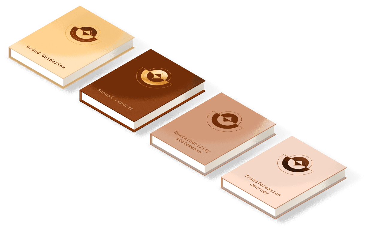
I looked through anything I could find — anything that might give me a hint about their thinking and direction
Speeches and interviews by the chairman
To understand the leadership’s emotional tone and voice
Annual reports and sustainability statements
To uncover the core values, vision, mission, and business direction
Bank’s transformation journey information
To learn more about their clients, the target users, and the new transition users.
This gave me just enough to begin crafting a design story that didn’t just look modern — but felt like them.
03/
Didn’t abandon the users
At this stage, I still considered myself a UI designer — not a UX researcher. But we weren’t completely in the dark.
We used what we had
Raw feedback from the client’s internal teams
Survey data from existing users
Common complaints about the current app’s usability
These fragments helped us identify pain points: What people struggled with. Where they dropped off. What they found frustrating.It wasn’t perfect, but it was enough to build a defensible foundation for our design logic.
04/
An unexpected finding
Feng Shui matters.
I thought I had most things figured out, but then I learned something important: the chairman really cared about feng shui — not just as a belief, but as something that actually shaped decisions. From then on, it wasn’t just about making things usable or on-brand — it had to feel balanced and harmonious.
Chapter 3.2
Find a way to the answer the questions without direct input
Instead of waiting for clarity, I started extracting meaning from the silence.
01/
Start with the brand guideline
Brand guidelines are often the most honest reflection of a company’s identity and ambition. They may not tell the whole story, but they’re usually a good place to start
The problem?
LPBank’s rebranding was still fresh. The visual system had just been introduced, and I only had a limited set of assets: a color palette, a primary typeface, and a few visual patterns. It wasn’t enough to design with confidence — not yet.
02/
Digging into the “dry stuff”
I looked through anything I could find — anything that might give me a hint about their thinking and direction
Speeches and interviews by the chairman
To understand the leadership’s emotional tone and voice
Annual reports and sustainability statements
To uncover the core values, vision, mission, and business direction
Bank’s transformation journey information
To learn more about their clients, the target users, and the new transition users.
This gave me just enough to begin crafting a design story that didn’t just look modern — but felt like them.
03/
Didn’t abandon the users
At this stage, I still considered myself a UI designer — not a UX researcher. But we weren’t completely in the dark.
We used what we had
Raw feedback from the client’s internal teams
Survey data from existing users
Common complaints about the current app’s usability
These fragments helped us identify pain points: What people struggled with. Where they dropped off. What they found frustrating.It wasn’t perfect, but it was enough to build a defensible foundation for our design logic.
04/
An unexpected Finding
Feng Shui matters.
I thought I had most things figured out, but then I learned something important: the chairman really cared about feng shui — not just as a belief, but as something that actually shaped decisions. From then on, it wasn’t just about making things usable or on-brand — it had to feel balanced and harmonious.
Chapter 3.2
Find a way to the answer the questions without direct input
Instead of waiting for clarity, I started extracting meaning from the silence.
01/
Start with the brand guideline
Brand guidelines are often the most honest reflection of a company’s identity and ambition. They may not tell the whole story, but they’re usually a good place to start
The problem?
LPBank’s rebranding was still fresh. The visual system had just been introduced, and I only had a limited set of assets: a color palette, a primary typeface, and a few visual patterns. It wasn’t enough to design with confidence — not yet.
02/
Digging into the “dry stuff”
I looked through anything I could find — anything that might give me a hint about their thinking and direction
Speeches and interviews by the chairman
To understand the leadership’s emotional tone and voice
Annual reports and sustainability statements
To uncover the core values, vision, mission, and business direction
Bank’s transformation journey information
To learn more about their clients, the target users, and the new transition users.
This gave me just enough to begin crafting a design story that didn’t just look modern — but felt like them.
03/
Didn’t abandon the users
At this stage, I still considered myself a UI designer — not a UX researcher. But we weren’t completely in the dark.
We used what we had
Raw feedback from the client’s internal teams
Survey data from existing users
Common complaints about the current app’s usability
These fragments helped us identify pain points: What people struggled with. Where they dropped off. What they found frustrating.It wasn’t perfect, but it was enough to build a defensible foundation for our design logic.
04/
An unexpected finding
Feng Shui matters.
I thought I had most things figured out, but then I learned something important: the chairman really cared about feng shui — not just as a belief, but as something that actually shaped decisions. From then on, it wasn’t just about making things usable or on-brand — it had to feel balanced and harmonious.
Chapter 3.2
Find a way to the answer the questions without direct input
Instead of waiting for clarity, I started extracting meaning from the silence.
01/
Start with the brand guideline
Brand guidelines are often the most honest reflection of a company’s identity and ambition. They may not tell the whole story, but they’re usually a good place to start
The problem?
LPBank’s rebranding was still fresh. The visual system had just been introduced, and I only had a limited set of assets: a color palette, a primary typeface, and a few visual patterns. It wasn’t enough to design with confidence — not yet.
02/
Digging into the “dry stuff”
I looked through anything I could find — anything that might give me a hint about their thinking and direction
Speeches and interviews by the chairman
To understand the leadership’s emotional tone and voice
Annual reports and sustainability statements
To uncover the core values, vision, mission, and business direction
Bank’s transformation journey information
To learn more about their clients, the target users, and the new transition users.
This gave me just enough to begin crafting a design story that didn’t just look modern — but felt like them.
03/
Didn’t abandon the users
At this stage, I still considered myself a UI designer — not a UX researcher. But we weren’t completely in the dark.
We used what we had
Raw feedback from the client’s internal teams
Survey data from existing users
Common complaints about the current app’s usability
These fragments helped us identify pain points: What people struggled with. Where they dropped off. What they found frustrating.It wasn’t perfect, but it was enough to build a defensible foundation for our design logic.
04/
An unexpected finding
Feng Shui matters.
I thought I had most things figured out, but then I learned something important: the chairman really cared about feng shui — not just as a belief, but as something that actually shaped decisions. From then on, it wasn’t just about making things usable or on-brand — it had to feel balanced and harmonious.
Chapter 3.3
What I uncovered
Foundation of the concept
Simply put, the concept needed to address the needs and expectations of four key groups, and each group came with their own priorities
01/
Leadership will

Leadership Vision
The bank wasn’t just asking for a modern design. What they really wanted was a product that showed they were moving forward — something bold, clear, and full of new energy.
Cultural importance
Innovation alone wasn’t enough. The design had to feel grounded in Vietnamese culture — especially with feng shui playing such a central role in leadership decisions.
02/
Business
Flexibility
The design needed to be scalable in the long run, supporting the vision of becoming more than just a traditional financial app. It also had to be adaptable, as the current transformation was still in its early and unrefined stage.
Evolving identity
LPBank’s brand was still in flux. That meant the design needed to lead — not just follow. I had to build something strong enough to guide the visual direction moving forward.
03/
Technology
Simplicity and efficiency
The product had to ensure a smooth transition from the old version to the new one in the shortest time possible — balancing innovation with the practical limits of existing technology.
04/
User
Design for everybody
With the broad infrastructure inherited from LienvietPost Bank, the design had to serve a wide range of users — especially those in tier-2 cities and rural areas.
User clarity
Even without full UX research, internal feedback showed a pattern: users wanted simplicity, speed, and a clearer path through the app.
Simply put, the concept needed to address the needs and expectations of four key groups, and each group came with their own priorities
01/
Leadership will
Leadership Vision
The bank wasn’t just asking for a modern design. What they really wanted was a product that showed they were moving forward — something bold, clear, and full of new energy.
Cultural importance
Innovation alone wasn’t enough. The design had to feel grounded in Vietnamese culture — especially with feng shui playing such a central role in leadership decisions.
02/
Business
Flexibility
The design needed to be scalable in the long run, supporting the vision of becoming more than just a traditional financial app. It also had to be adaptable, as the current transformation was still in its early and unrefined stage.
Evolving identity
LPBank’s brand was still in flux. That meant the design needed to lead — not just follow. I had to build something strong enough to guide the visual direction moving forward.
03/
Technology
Simplicity and efficiency
The product had to ensure a smooth transition from the old version to the new one in the shortest time possible — balancing innovation with the practical limits of existing technology.
04/
User
Design for everybody
With the broad infrastructure inherited from LienvietPost Bank, the design had to serve a wide range of users — especially those in tier-2 cities and rural areas.
User clarity
Even without full UX research, internal feedback showed a pattern: users wanted simplicity, speed, and a clearer path through the app.
Chapter 3.4
From Concept to the Boardroom
Based on the findings we uncovered earlier, my bro @TienTien and I explored many different styles. Each concept was built around a distinct core idea — each one tied to one or more key insights we had gathered. But at the end of the day, we had to choose just one.


The chosen concept
Dynamic
A design that could easily adapt to various needs while still staying grounded in a few core values
Brand character
Keeping traditional brand traits, but refreshing the visuals to make it feel more current and relatable
Keeping traditional brand traits, but refreshing the visuals to make it feel more current and relatable
/01
Cultural values
Applying feng shui principles to create a sense of familiarity and positive meaning
Applying feng shui principles to create a sense of familiarity and positive meaning
/02
Modernity
Showing LPBank’s spirit of innovation and its ambition to become a modern digital bank
Showing LPBank’s spirit of innovation and its ambition to become a modern digital bank
/03

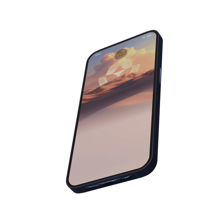
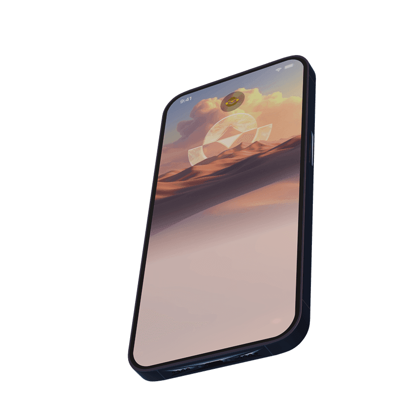
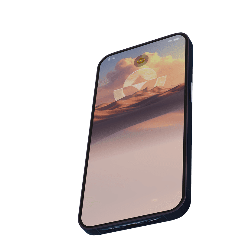
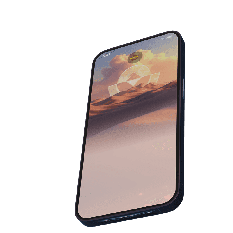
The Concept
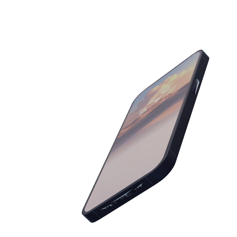
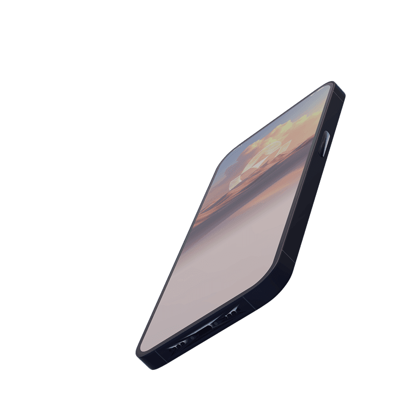
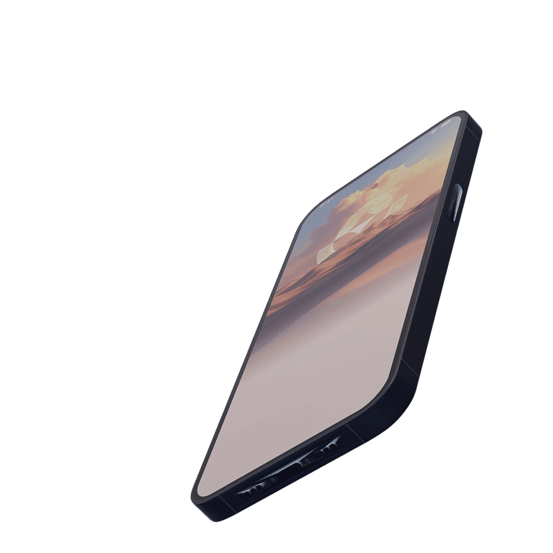
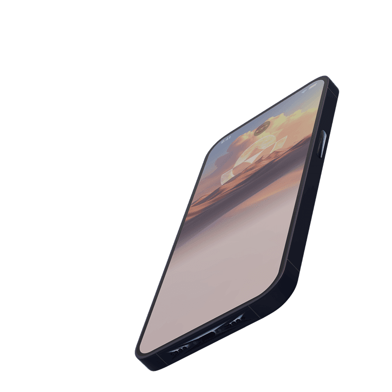
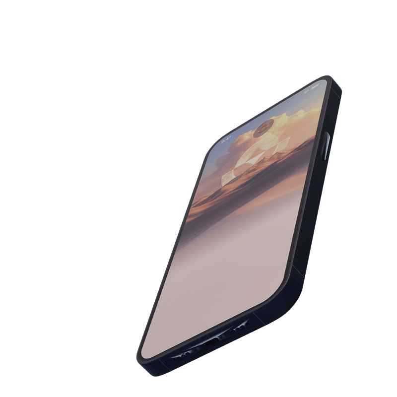
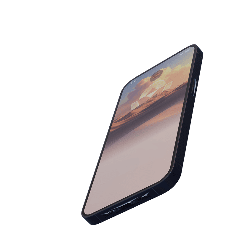
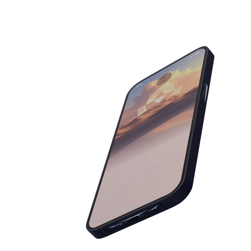
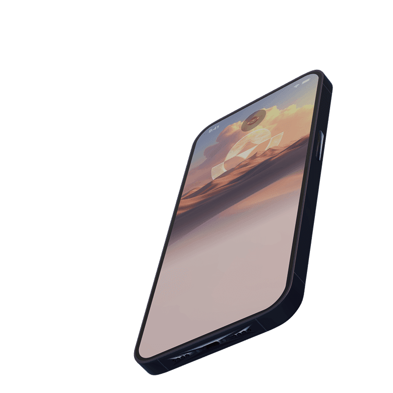
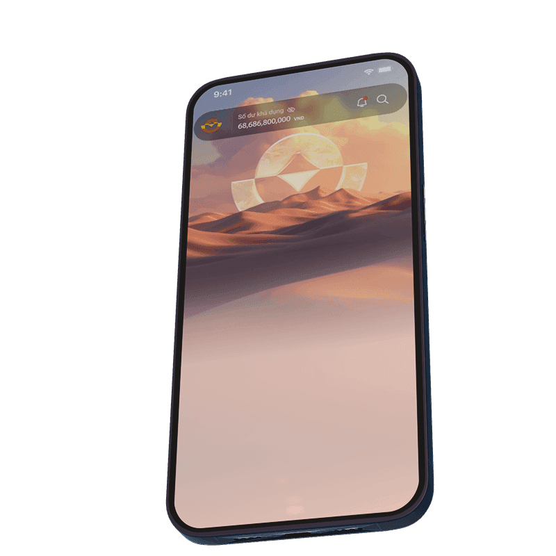
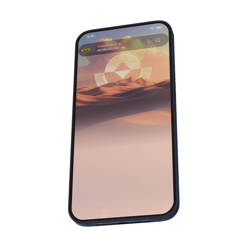
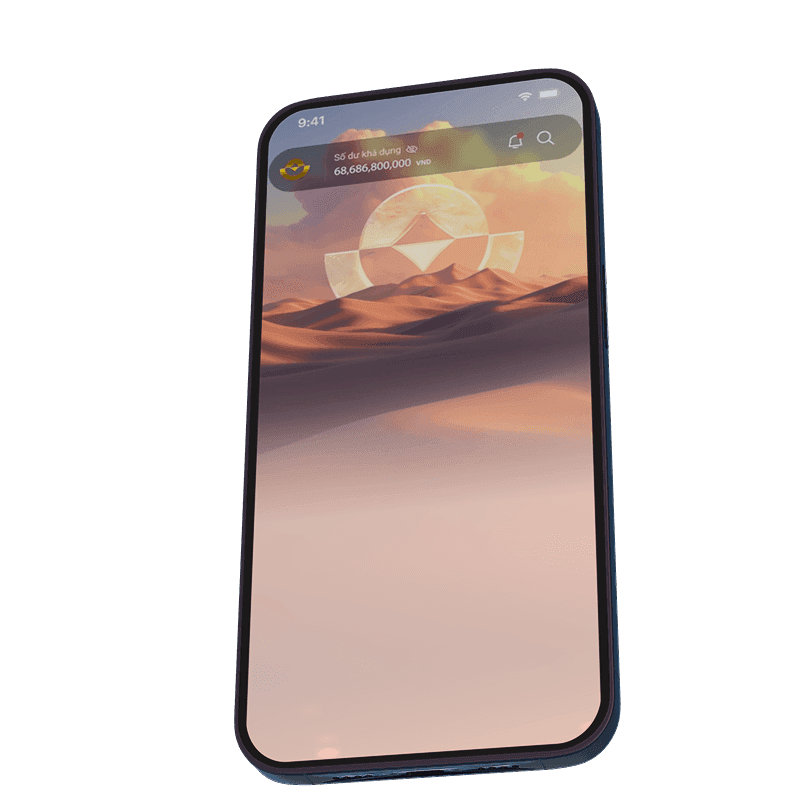
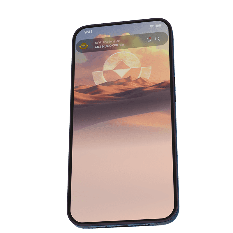
Home Screen
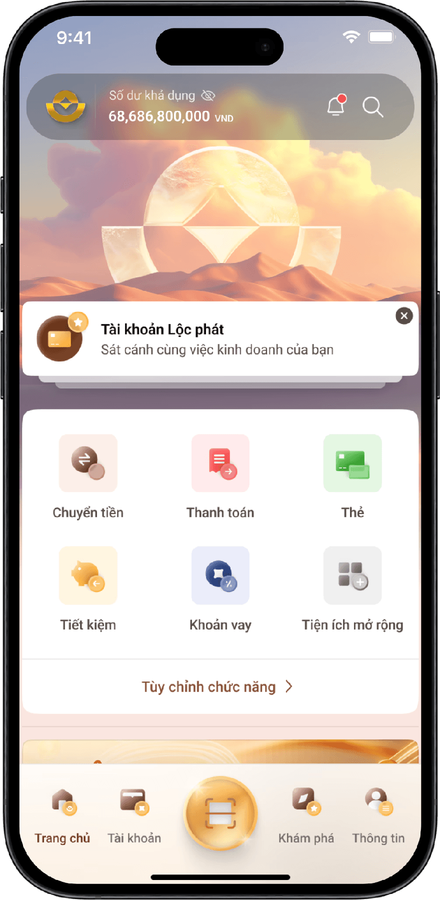
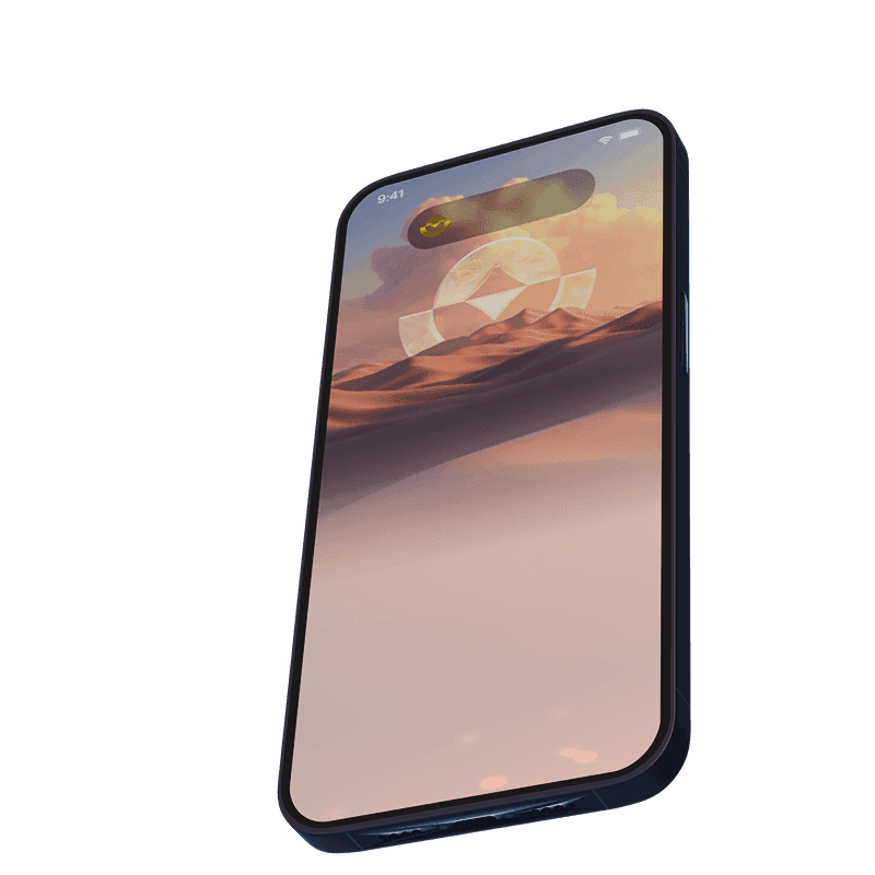
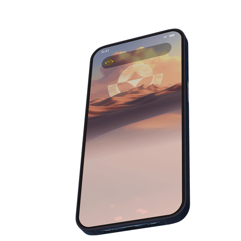
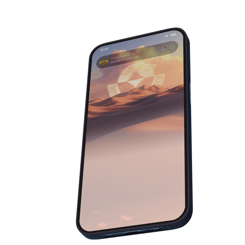
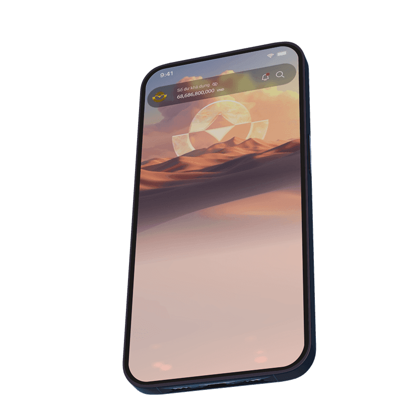
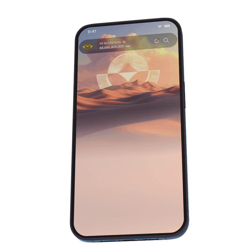
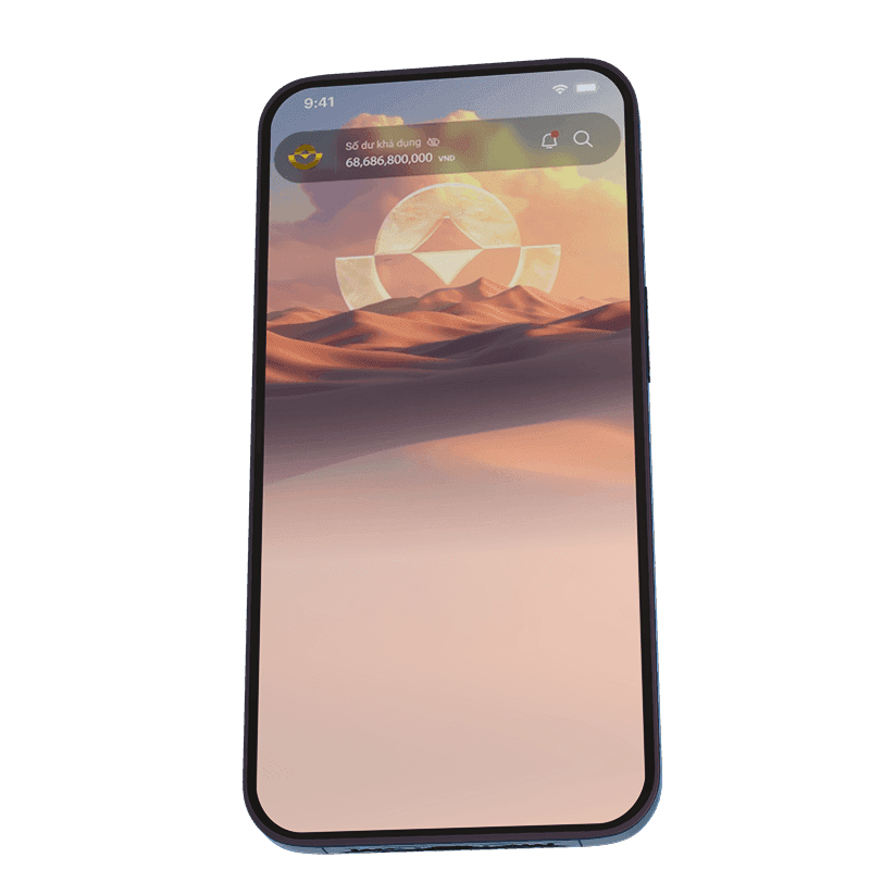
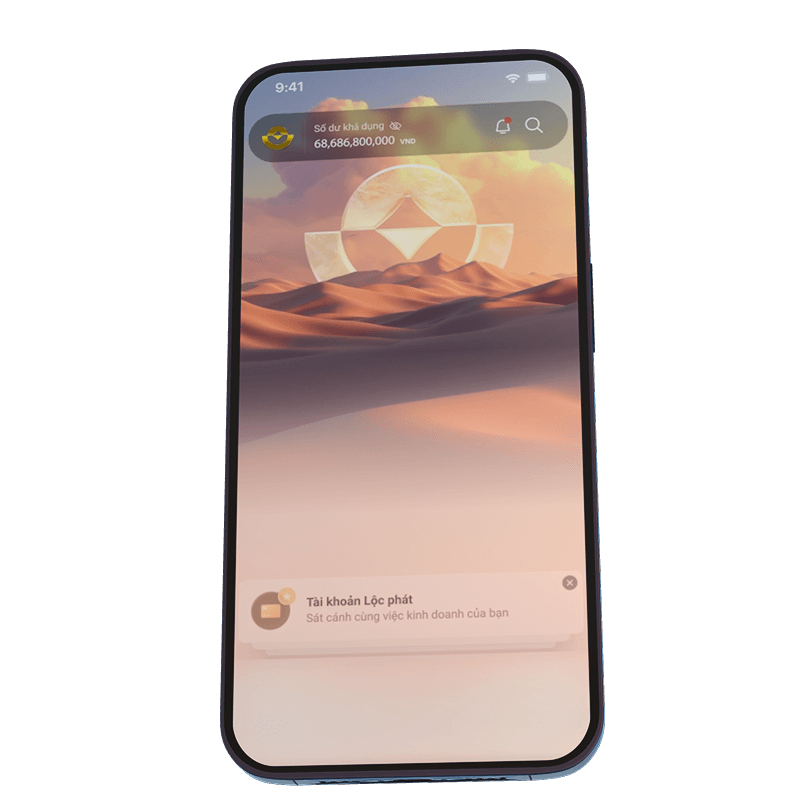
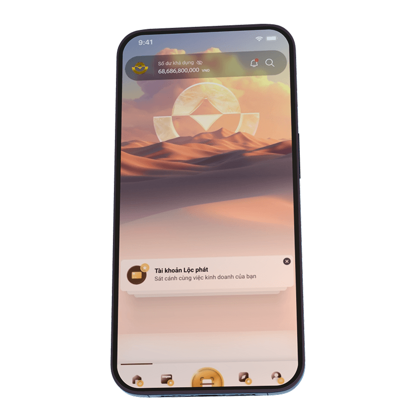
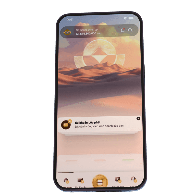
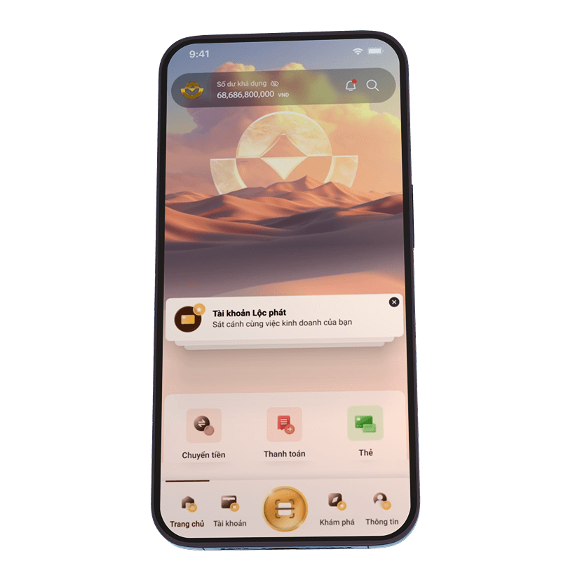
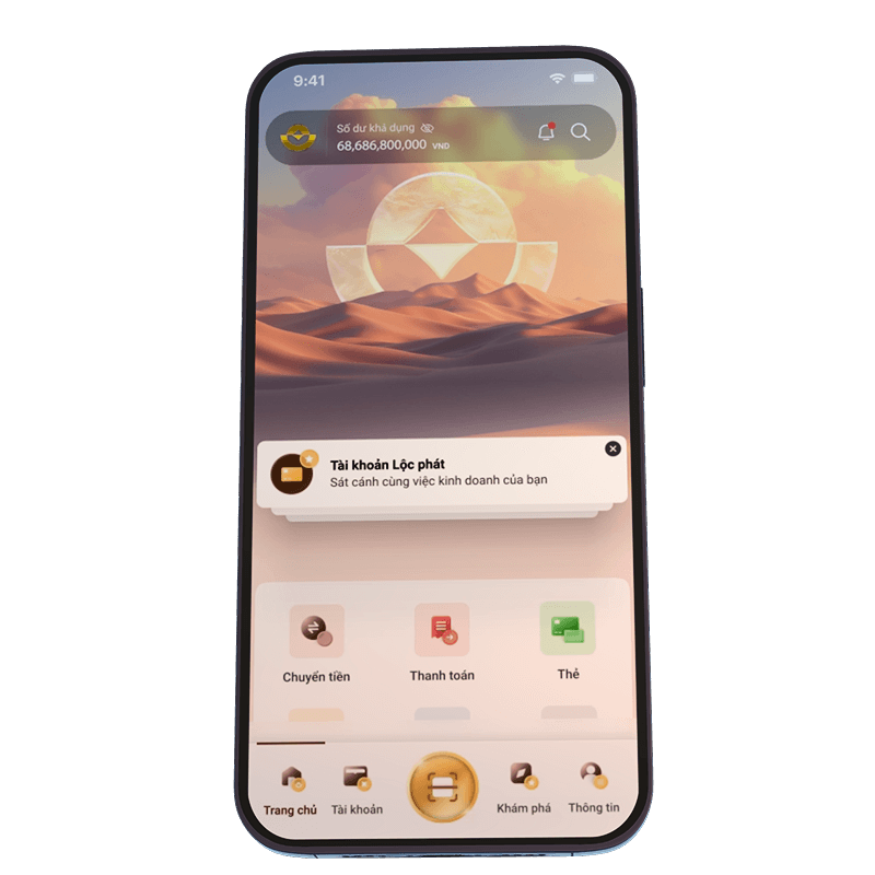
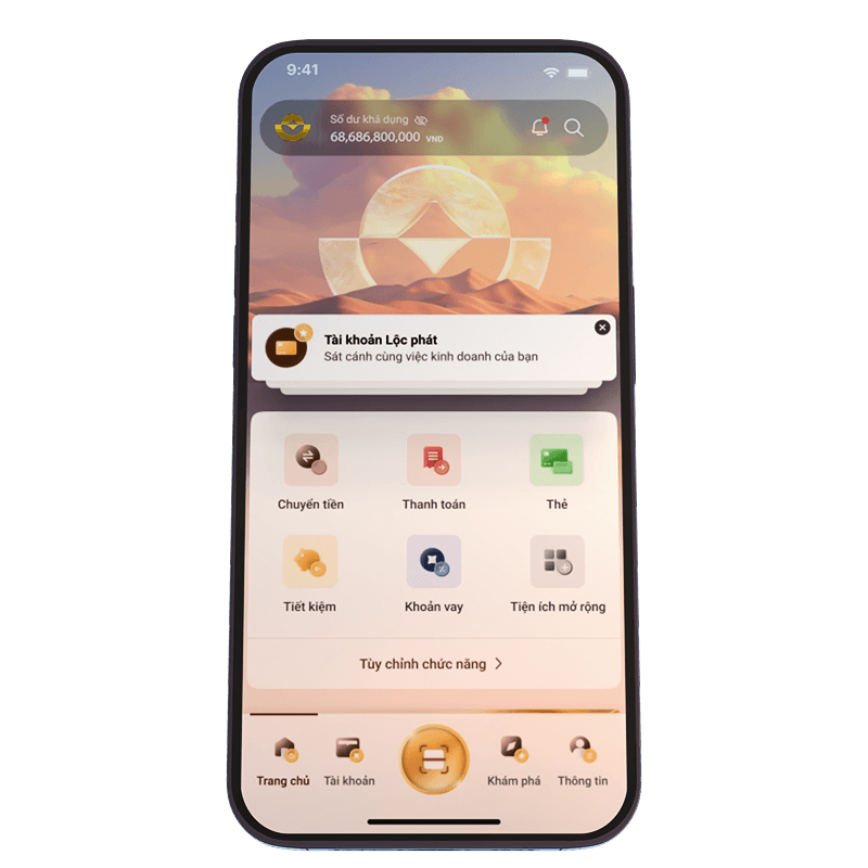
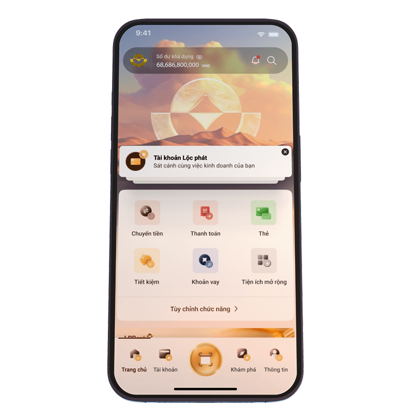
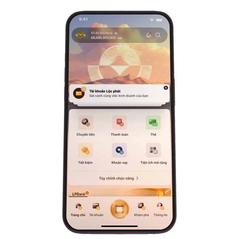
The home screen, being the most important touchpoint, was completely restructured. I tried to keep a balance: not too minimal that it feels empty, and not too cluttered that it overwhelms users.


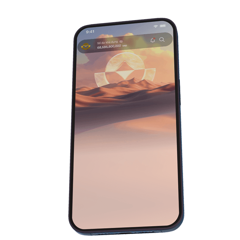


Key Feature


A clear
structural layout
A clear
structural layout
A clear
structural layout
The new homepage was designed to be a complete contrast to the old one. Instead of using a single rigid frame, we built a clearer and more flexible layout — something that could adapt better to business needs, support future personalization, and still give enough space for the bank’s brand identity to shine
We built a clearer and more flexible layout — something that could adapt better to business needs, support future personalization, and still give enough space for the bank’s brand identity to shine
We built a clearer and more flexible layout — something that could adapt better to business needs, support future personalization, and still give enough space for the bank’s brand identity to shine

Customized icon set with a range of meaningful purpose


Customized icon set with a range of meaningful purpose
Customized icon set with a range of meaningful purpose
Customized icon set with a range of meaningful purpose


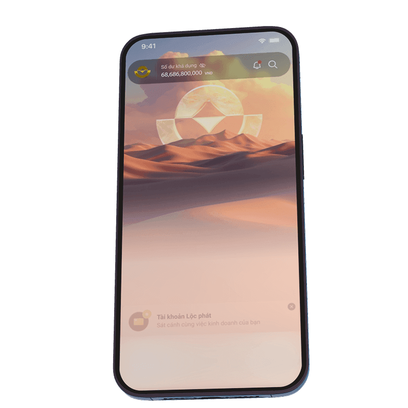
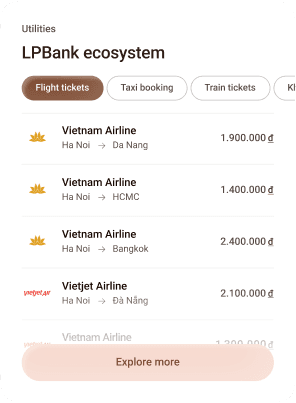
Smoother way to present upselling opportunities
I know users are rarely excited about upselling or cross-selling—especially when it hits them right after opening the app through an intrusive popup. But the truth is, it’s part of doing business, and it needs a spot that still gets user attention. After testing multiple approaches, I took inspiration from iPhone-style notifications and integrated personalized product recommendations in a subtle but visible area. These suggestions are based on the user's financial behavior, product usage, and cash flow. Importantly, they’re easy to dismiss if not relevant, so users stay in control. This approach strikes a balance between business goals and maintaining a smooth, familiar user experience.

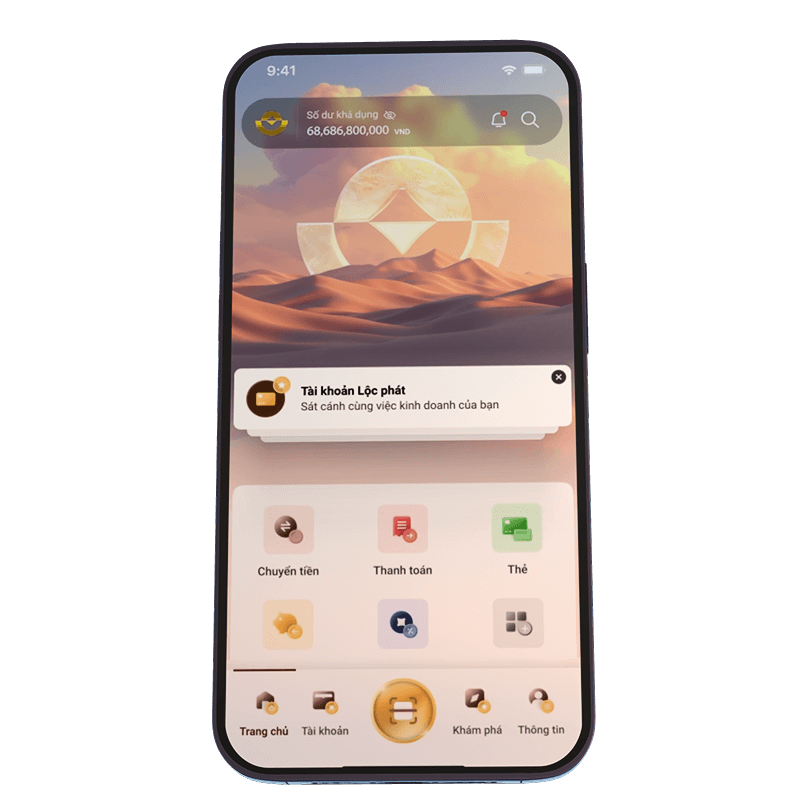
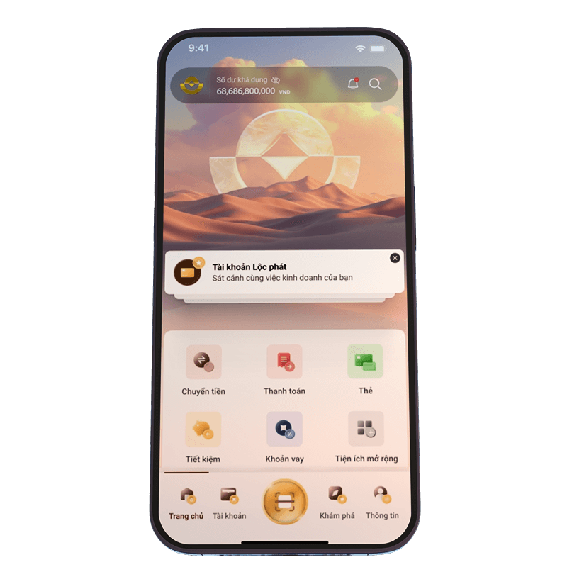
Custom quick access
Add funcition
Add funcition

Add funcition
Add funcition
Add funcition

Show more
Add your favorite funcition
Drag or select to fill quick access to slot
Search funcition

Transer

Bill payment

Card

Saving

Loan

Cashback

Phone
services

Insurance

Train tickets

Personalize the homepage to
suit your preferences

Make the design more customizable
Customize Quick Access
This isn't exactly a new feature, but it's still an essential one. It allows users to quickly reach their most-used functions. After all, every user has different needs and habits when it comes to using the app.
Customize Widget
This feature doesn’t exist in the current version yet, but it’s part of a long-term vision for a more personalized app experience. I believe everyone has their own financial motivations, so the dashboard should be customizable to reflect each user’s needs — rather than cramming everything into a fixed layout. This flexibility also gives the bank more room to expand and evolve content without being limited by the current structure.
Custom quick access
Add funcition
Add funcition
Add funcition
Add funcition
Add funcition
Show more
Add your favorite funcition
Drag or select to fill quick access to slot
Search funcition
Transer
Bill payment
Card
Saving
Loan
Cashback
Phone
services
Insurance
Train tickets
Personalize the homepage to
suit your preferences
Make the design more customizable
Customize Quick Access
This isn't exactly a new feature, but it's still an essential one. It allows users to quickly reach their most-used functions. After all, every user has different needs and habits when it comes to using the app.
Customize Widget
This feature doesn’t exist in the current version yet, but it’s part of a long-term vision for a more personalized app experience. I believe everyone has their own financial motivations, so the dashboard should be customizable to reflect each user’s needs — rather than cramming everything into a fixed layout. This flexibility also gives the bank more room to expand and evolve content without being limited by the current structure.
Customeize quick Access
This isn't exactly a new feature, but it's still an essential one. It allows users to quickly reach their most-used functions. After all, every user has different needs and habits when it comes to using the app.
Custom quick access
Add funcition
Add funcition
Add funcition
Add funcition
Add funcition
Show more
Add your favorite funcition
Drag or select to fill quick access to slot
Search funcition
Transer
Bill payment
Card
Saving
Loan
Cashback
Phone
services
Insurance
Train tickets
Customize Widget
This feature doesn’t exist in the current version yet, but it’s part of a long-term vision for a more personalized app experience. I believe everyone has their own financial motivations, so the dashboard should be customizable to reflect each user’s needs — rather than cramming everything into a fixed layout. This flexibility also gives the bank more room to expand and evolve content without being limited by the current structure.
Personalize the homepage to
suit your preferences

The Prototype
The Prototype
The Prototype
Make it real
Make it real
Make it real
We all know static screens aren’t enough. You can’t expect stakeholders to imagine how it works just by flipping through Figma frames.
So, I built interactive prototypes — as close to a real app as possible. Every animation, transition, logic between screens was carefully crafted to reflect real user flow
In the Boardroom
Presenting in front of top leaders
Honestly, I was nervous — I even took a small sip of wine before the final rehearsal, just to steady myself. But when it was time to present, something just clicked. Somehow, it all came together. The concept was chosen, and the project moved forward.
One of the most valuable experiences I’ve had in my career so far
“
It’s not every day you talk to people worth a thousand billion
My teammate joked — a little confidence booster, you know
This part of the journey showed me that design isn’t just solving problems — it’s about listening, even in silence. It’s about making something that quietly feels right.
This part of the journey showed me that design isn’t just solving problems — it’s about listening, even in silence. It’s about making something that quietly feels right.
This part of the journey showed me that design isn’t just solving problems — it’s about listening, even in silence. It’s about making something that quietly feels right.
This part of the journey showed me that design isn’t just solving problems — it’s about listening, even in silence. It’s about making something that quietly feels right.
This part of the journey showed me that design isn’t just solving problems — it’s about listening, even in silence. It’s about making something that quietly feels right.
Chapter 4
Cleaning up before moving forward
Right after the concept was approved, we had to jump straight into the next step — fixing the information structure and starting the wireframes.
Chapter 4
Cleaning up before moving forward
Right after the concept was approved, we had to jump straight into the next step — fixing the information structure and starting the wireframes.
Chapter 4
Cleaning up before moving forward
Right after the concept was approved, we had to jump straight into the next step — fixing the information structure and starting the wireframes.
Chapter 4
Cleaning up before moving forward
Right after the concept was approved, we had to jump straight into the next step — fixing the information structure and starting the wireframes.
Chapter 4
Cleaning up before moving forward
Right after the concept was approved, we had to jump straight into the next step — fixing the information structure and starting the wireframes.
Information Architecture
I worked closely with someone from LPBank who knew the current app inside out. Together, we looked into user data, spotted a few clear problems, and found ways to fix them.
Content proximity
Information was scattered across the app — users didn’t know where to find what they needed. So we focused on grouping related content closer together. The more relevant, the more familiar it feels
Flow complexity
Some features were broken down into too many steps, making the experience confusing. We decided to merge similar information where it made sense, reducing system complexity and making things easier to navigate
The disappearance of Vi Viet
LPBank had just phased out its e-wallet, Vi Viet. That left empty spaces in the app — both in flow and content — that we needed to clean up and reorganize.
Wireframe
Once we sorted out the information structure, it was time to move into wireframes. Yeah, maybe you will have a question “why you make the wireframe after you have the hifi concept”. The concept is just the idea, the direction of the UI, we still need the wireframe for overall other funcition before going to the hifi of them
“
If the wireframes are done right, everything after that becomes much easier.
Just my thought
People often said wireframes are just placeholders — something quick to sketch out ideas. But through real project experience, I learned that a solid wireframe is where everything starts right. It's not just about testing layout — it needs to reflect the real content, real functions, and real flow. If you wait until the hi-fi stage to fix missing pieces, it’ll cost more time and effort. So for me, getting the wireframe right means we can move faster and smoother later on.
The way i start with wireframing
01/
Start from rough ideas — like chicken-scratch sketches on paper
02/
Turn them into digital wireframes that clearly show the right functions
03/
Fill in accurate content — correct format, correct structure
04/
Create complete wireflows to show how screens connect together
Wireframe demo

Click here to change demo page
Last Update
July 2024
In charge
Mchis, Chance
Approved
Final
LPBank Mobile App Wireframe
LPBank Personal Banking - Mobile App
Select flow
Thumbnail
LogIn&SignUp / LogIn
MoneyTransfer / ToOther
Wireframe demo
Click here to change demo page
Last Update
July 2024
In charge
Mchis, Chance
Approved
Final
LPBank Mobile App Wireframe
LPBank Personal Banking - Mobile App
Select flow
Thumbnail
LogIn&SignUp / LogIn
MoneyTransfer / ToOther
Wireframe demo
Click here to change demo page
Last Update
July 2024
In charge
Mchis, Chance
Approved
Final
LPBank Mobile App Wireframe
LPBank Personal Banking - Mobile App
Select flow
Thumbnail
LogIn&SignUp / LogIn
MoneyTransfer / ToOther

Chapter 5
Building a Design System
Just funny, I know it’s not a proper design system, more like a reusable library or a collection of expandable elements. But still, I think calling it a “design system” makes sense for us designers in some way
To me, a design system isn’t just a bunch of buttons, colors, or text styles. It’s more like a backbone — something the whole team can rely on. It helps everyone save time, avoid repeating work, easy to change and faster for handoff.
I chose not to use a pre-made UI kit. Why? Because every designer has their own way of working. I wanted to build a system that truly fits my process — one that solves the pain points I’ve often faced in real projects.
How i do it in my way
01/
Organize the design concept
Start with an MVP, based on the approved concept to organize the basic element (color/ typo / spacing / effect / component / ...)
02/
Build the foundations
03/
Set up basic components
04/
Create common component groups (molecules)
05/
Make a few typical page templates
06/
Guidelines and best practices
MVP
Design
system
Hifi
design
Report usability
Report usability
Request new
Request new
Report bug
Report bug
Integrate components
Integrate components
Update
Update
MVP
Design
system
Hifi
design
Report usability
Request new
Report bug
Integrate components
Update
And of course, work didn’t stop there.
And of course, work didn’t stop there.
And of course, work didn’t stop there.
Throughout the whole project, I kept an eye on how people were using the system — what worked, what didn’t, what was missing. We kept improving it along the way.
Because to me, a design system grows with the product.
Throughout the whole project, I kept an eye on how people were using the system — what worked, what didn’t, what was missing. We kept improving it along the way.
Because to me, a design system grows with the product.
Throughout the whole project, I kept an eye on how people were using the system — what worked, what didn’t, what was missing. We kept improving it along the way.
Because to me, a design system grows with the product.
Chapter 6
Some funny stories behind the final design
This was probably the most enjoyable phase of the whole project (at least for me, as a UI designer) , the moment I got to actually design. Dive into colors, shapes, and delightful visuals. No more dull grey boxes or dry chunks of information. Just pure joy of creating something that feels alive.
This was probably the most enjoyable phase of the whole project (at least for me, as a UI designer) , the moment I got to actually design. Dive into colors, shapes, and delightful visuals. No more dull grey boxes or dry chunks of information. Just pure joy of creating something that feels alive.
But, reality is rarely that rosy. Designing UI sounds fun, but the creative freedom isn’t as much as a newbie might think. Most of the time, it’s about making things logical, practical, and still visually pleasing. Those were the days of late-night grinding, fueled by way too many cans of energy drinks. Still, it was a tough but wonderful experience.
But, reality is rarely that rosy. Designing UI sounds fun, but the creative freedom isn’t as much as a newbie might think. Most of the time, it’s about making things logical, practical, and still visually pleasing. Those were the days of late-night grinding, fueled by way too many cans of energy drinks. Still, it was a tough but wonderful experience.

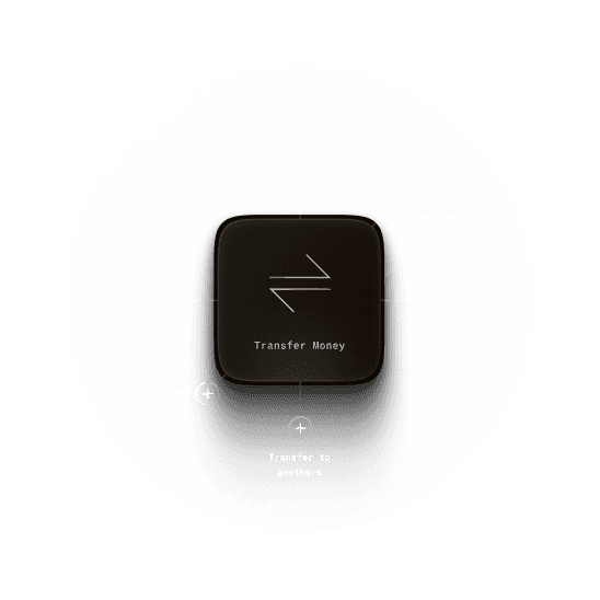
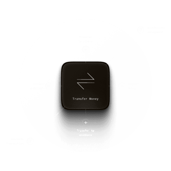
Money
Transfer
Money Transfer
Money Transfer
This is probably one of the most important and frequently used features in any banking app. It plays a key role in the daily experience of most customers. So naturally, giving its UI the attention it deserves was essential.
This is probably one of the most important and frequently used features in any banking app. It plays a key role in the daily experience of most customers. So naturally, giving its UI the attention it deserves was essential.
After spending some time working closely with the bridge person and connect with the tech and business teams, we decided it was time for a change. And here’s the story behind that decision.
After spending some time working closely with the bridge person and connect with the tech and business teams, we decided it was time for a change. And here’s the story behind that decision.
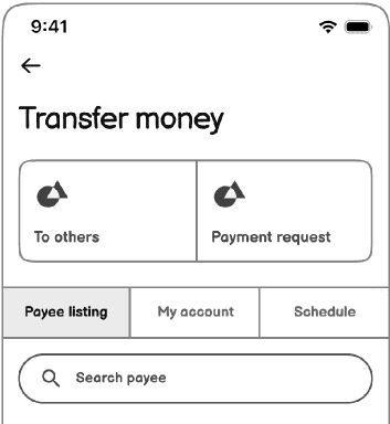
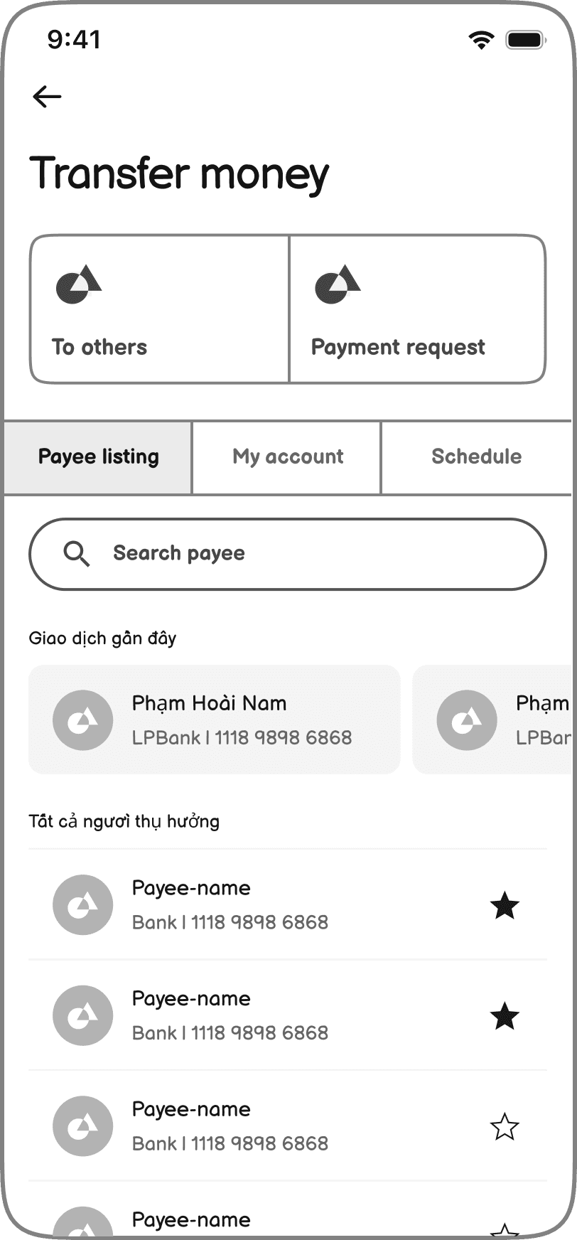
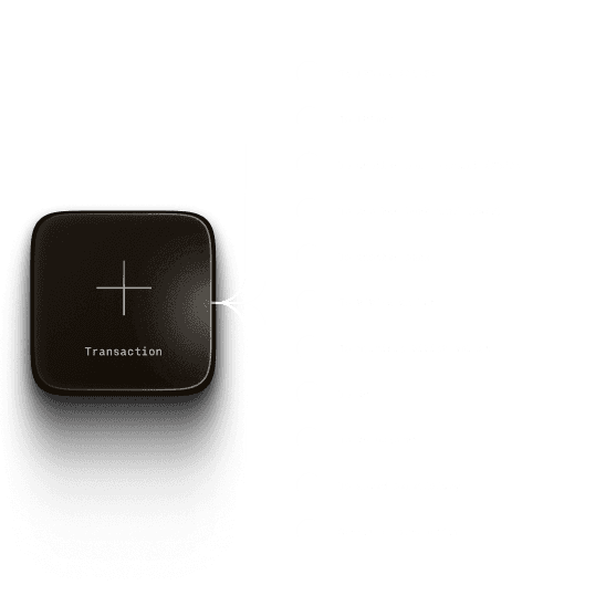
One simple hub
What happened?
"Where can I find my favorite contacts? Where do I schedule a transaction? Why do I have to dig into settings just to find them? How do I transfer money to my own account?" It became clear that many supporting features were too scattered, making it difficult for users to find what they needed.
What i've done
In the end, we brought everything related to transferring money into one place Everything is now in one spot — simple, clean, and easy to use.
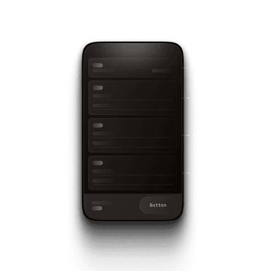
Simplify user choosen
What happened?
From the start, one thing was clear: the old transfer flow was messy. There were just too many options (Transfer to LPBank account, Transfer to another bank account (24/7), Transfer to another bank card, Standard transfer to other banks…). All of them sounded similar. For regular users, it was overwhelming. Even experienced users would often pause, unsure which one to pick. Instead of helping people move faster, the app made them stop and think too much.
What i've done
After looking into the technology, policies, and transfer procedures, we decided to simplify the way users create a new transaction. Instead of making them think too much about what type of transfer they’re making, the new flow takes them straight to the transaction form. From there, they just need to fill in a few basic details like the receiver’s name, bank, and amount. Based on that, the system will figure out the right type of transfer automatically. We also reorganized the features for managing beneficiaries and transaction history to make the whole process cleaner and easier to follow.
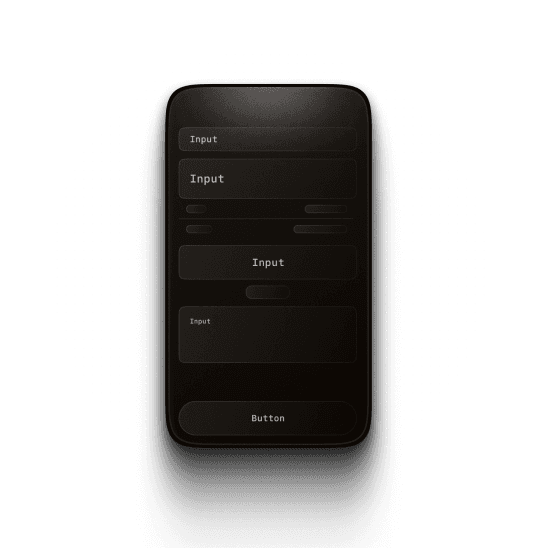
Clearer structure and optimized flow
What happened?
One thing we noticed was that the input form for creating a new transfer had some UI issues. The elements used were not consistent — different types of inputs were styled differently, and there wasn’t a clear visual unity. On top of that, the form’s structure didn’t have a clear hierarchy. The spacing between elements wasn’t properly aligned, which made it harder for users to read and fill out the information quickly.
What i've done
After aligning with the bridge person, we agreed to redesign the input form for better clarity and structure. The form is now split into clear sections: Source Account, Beneficiary, Transaction Details, and Schedule. Inputs were simplified for easier recognition and consistency. To avoid overwhelming users, the form now reveals one step at a time. Once a section is completed and verified, it collapses into a summary, and the next section appears — helping users stay focused and easily review their progress.
Schedule transaction more easily
What happened?
As mentioned above, scheduling a transaction is currently very inconvenient. The feature is hard to find and use. In addition , it only allows monthly schedule, and once set, it repeats by default until turned off.
What i've done
In the new version, this feature is moved to the main transfer management area and also integrated directly into the transfer form as a shortcut. This makes it much easier for users to set up a schedule transaction right when they’re creating a new one. Besides monthly transaction, users can now also schedule transfers by week or by day. They can set the transaction to run once, a certain number of times, or until a specific date. It’s all up to them. This new setup gives users more control and flexibility, while keeping everything simple and clear.
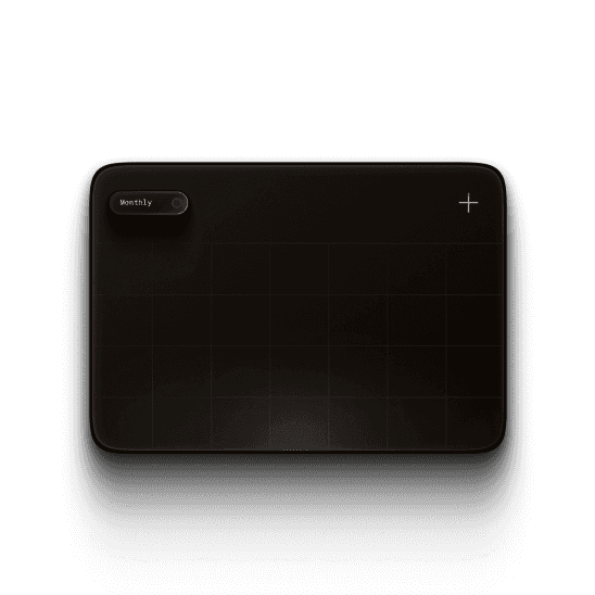
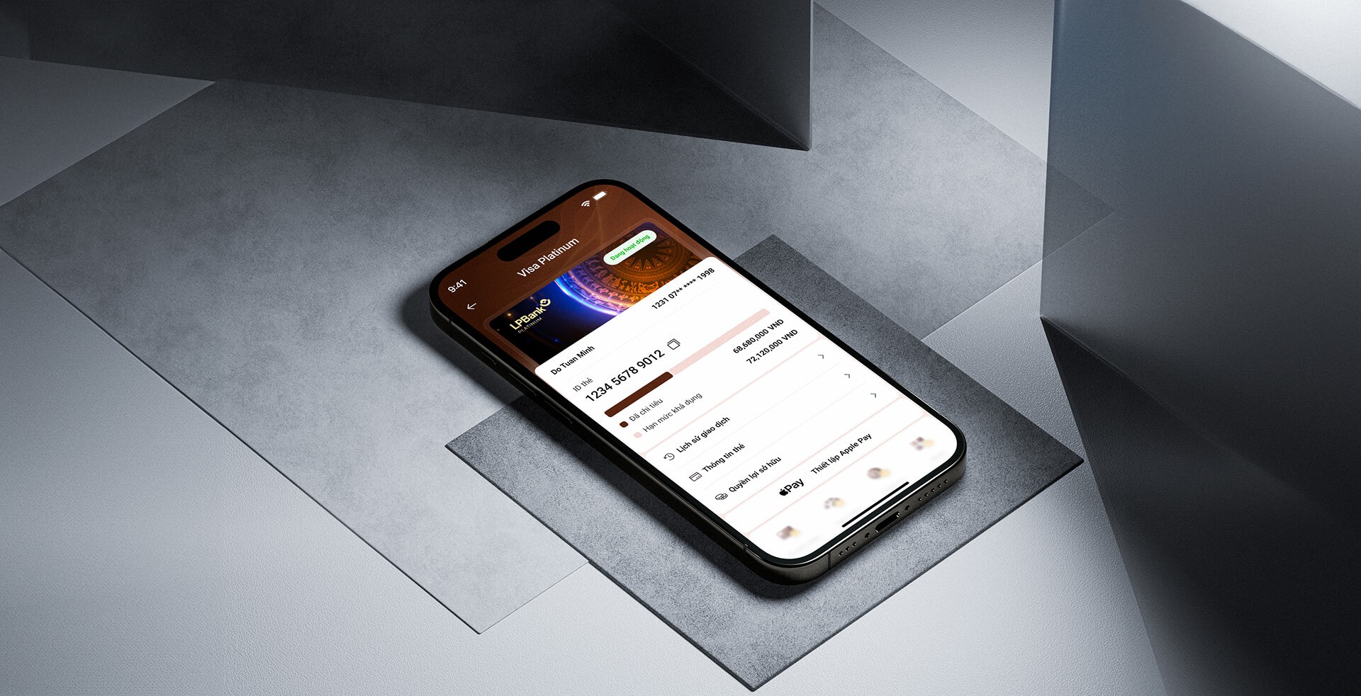
Card
management
Card management
Card management
One of the key tasks from the business team at LPBank was
“
Make card products more visible and appealing to users
They also wanted users to be able to explore card-related information more easily, from promotions and benefits to policies and unique features, so they could make the right choice. On top of that, they needed a better way for users to manage and track their cards.
One of the key tasks from the business team at LPBank was "Make card products more visible and appealing to users". They also wanted users to be able to explore card-related information more easily, from promotions and benefits to policies and unique features, so they could make the right choice. On top of that, they needed a better way for users to manage and track their cards.

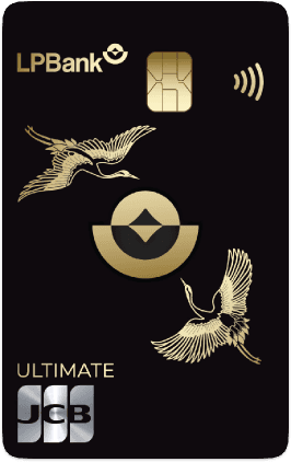

Card Management / Empty

Card Management / Opened
The story behind
Yeah, my design didn’t just come out of nowhere. It was built on real business needs, user experience analysis, and what users actually needed. From there, I found the right reasons to make improvements.
01/

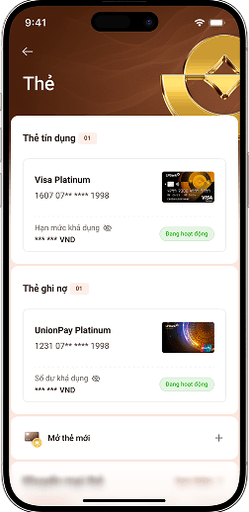
Card listing is easier to scan and manage
Problem
In the old design, users were taken straight into the card detail view using a carousel to switch between cards, skipping a proper listing page altogether. On top of that, it mixed active and inactive (unowned) cards in the same flow. This approach had two major issues.
First, today’s users often own multiple cards, both credit and debit, so using a carousel made it hard to get an overview or manage them effectively. Second, by blending owned and unowned cards together, it became harder to manage existing cards and also limited the chance to upsell new ones or promote other card-related features like rewards and offers.
New design
The new structure separates things more clearly, making it easier to browse, compare, and manage different card types. The listing page is now tailored to the user's state: if you don’t have any cards yet, the system suggests ones that fit your financial profile. If you already own cards, it helps you focus on tracking balances, checking limits, and managing details easily.
Plus, this new setup gives us a cleaner foundation to add supporting features like card promotions and reward points in the future.
02/

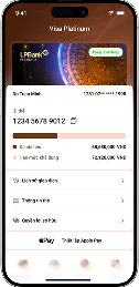
Card detail page shows functions in clear, organized groups
03/

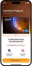
Product detail helps users compare different cards more easily
04/

One more thing
Card listing is easier to scan and manage
Problem
In the old design, users were taken straight into the card detail view using a carousel to switch between cards, skipping a proper listing page altogether. On top of that, it mixed active and inactive (unowned) cards in the same flow. This approach had two major issues.
First, today’s users often own multiple cards, both credit and debit, so using a carousel made it hard to get an overview or manage them effectively. Second, by blending owned and unowned cards together, it became harder to manage existing cards and also limited the chance to upsell new ones or promote other card-related features like rewards and offers.
New design
The new structure separates things more clearly, making it easier to browse, compare, and manage different card types. The listing page is now tailored to the user's state: if you don’t have any cards yet, the system suggests ones that fit your financial profile. If you already own cards, it helps you focus on tracking balances, checking limits, and managing details easily.
Plus, this new setup gives us a cleaner foundation to add supporting features like card promotions and reward points in the future.
Card detail page shows functions in clear, organized groups
Product detail helps users compare different cards more easily
One more thing
01/
Card listing is easier to scan and manage
Problem
In the old design, users were taken straight into the card detail view using a carousel to switch between cards, skipping a proper listing page altogether. On top of that, it mixed active and inactive (unowned) cards in the same flow. This approach had two major issues.
First, today’s users often own multiple cards, both credit and debit, so using a carousel made it hard to get an overview or manage them effectively. Second, by blending owned and unowned cards together, it became harder to manage existing cards and also limited the chance to upsell new ones or promote other card-related features like rewards and offers.
New design
The new structure separates things more clearly, making it easier to browse, compare, and manage different card types. The listing page is now tailored to the user's state: if you don’t have any cards yet, the system suggests ones that fit your financial profile. If you already own cards, it helps you focus on tracking balances, checking limits, and managing details easily.
Plus, this new setup gives us a cleaner foundation to add supporting features like card promotions and reward points in the future.
02/
Card detail page shows functions in clear, organized groups
03/
Product detail helps users compare different cards more easily
04/
One more thing

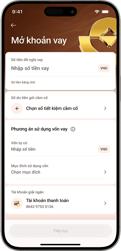
Loan
When I was assigned to the loan product section, the request from LPBank seemed straightforward: “Just convert the UI 1:1 from the excel file we sent”. No need to redesign the flow and content. Just make it look better.
When I was assigned to the loan product section, the request from LPBank seemed straightforward: “Just convert the UI 1:1 from the excel file we sent”. No need to redesign the flow and content. Just make it look better.
But when I dove deep into this feature, I realized it wasn’t simple. The logic was buried under messy layouts and jargon, making it hard for me to understand. So I paused the design to first truly understand the business rules.
But when I dove deep into this feature, I realized it wasn’t simple. The logic was buried under messy layouts and jargon, making it hard for me to understand. So I paused the design to first truly understand the business rules.
Unraveling the messy structure
Unlike other banking features, loan products operate based on more complex internal rules. The logic itself isn't too difficult to understand, but the way it was presented in the old app made it extremely confusing. All the content was cramped into a single long screen, filled with jargon and poorly structured information. It didn’t follow any clear process or priority, which made it hard even for me—someone trying to redesign it—to understand how it worked. So I paused the design work for a moment and focused on something more important: understanding the business logic behind it.
Relearning the process like a user
Designing a loan journey that mirrors real-world flow
Something i learned


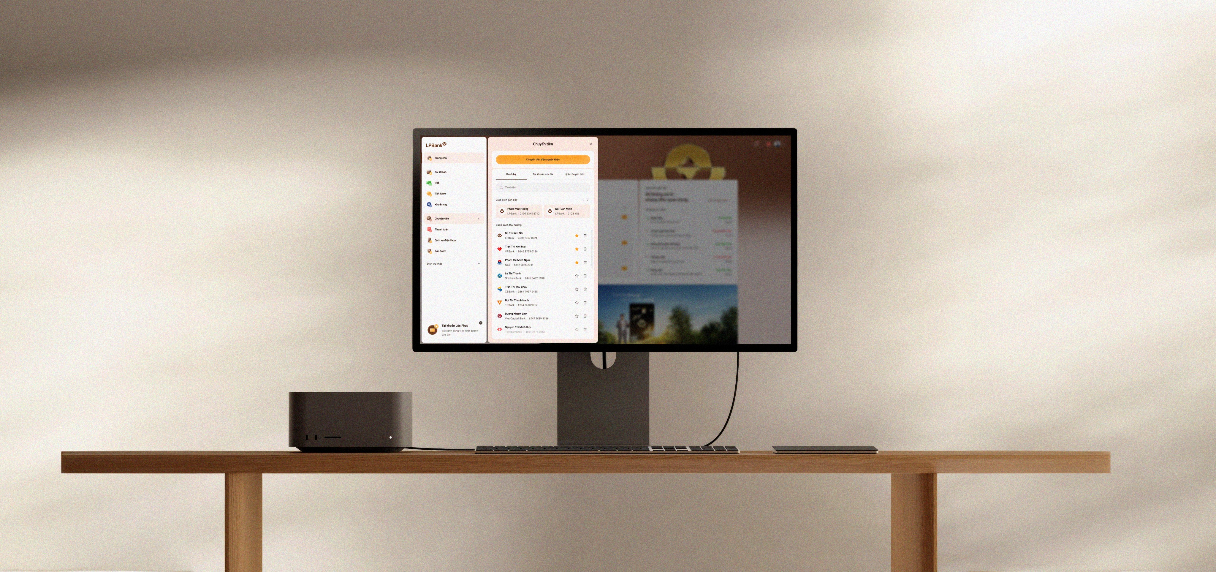
Chapter 7
The Ending
Well, if you’ve made it this far, I guess you’re someone who really cares. Honestly, that makes me truly happy.
To some “UX designers” or “Product designers,” maybe this whole thing feels a bit dramatic or even cliché. And I get that. I won’t deny it. I know I still lack a lot to call myself a real product designer. I don’t have fancy data, user persona, or impressive metrics to show .
That’s why, for now, I only dare to call myself a UI designer. But I’m trying, every day, to grow, to add the missing pieces and become a better version of myself.
There are often assumptions about designers on the “vendor side” like us — that we’re just “visual workers,” simply following orders. But this project proved otherwise.
We weren’t just a hand waiting for instructions. Every part of the process was thoughtful, structured, and backed by real thinking. We had our own logic, our own reasons for each design decision — not just copying what already existed.

The numbers
Designer on team (UI)
04
Day for delivery
72
Total designed screens
1000
+
Functional module
10
+
The numbers
Designer on team (UI)
04
Day for delivery
72
Total designed screens
1000
+
Functional module
10
+
The numbers
Designer on team (UI)
04
Day for delivery
72
Total designed screens
1000
+
Functional module
10
+

Next Project
Next Project
Agribank Portal Website
Agribank Portal Website
Website Redesign
Website Redesign

UI Design Portfolio
Project
LPBank Digital for Personal Customer
UI Design Portfolio
Pro-ject
LPBank Digital for Personal Customer
UI Design Portfolio
Project
LPBank Digital for Personal Customer
UI Design Portfolio
Project
LPBank Digital for Personal Customer